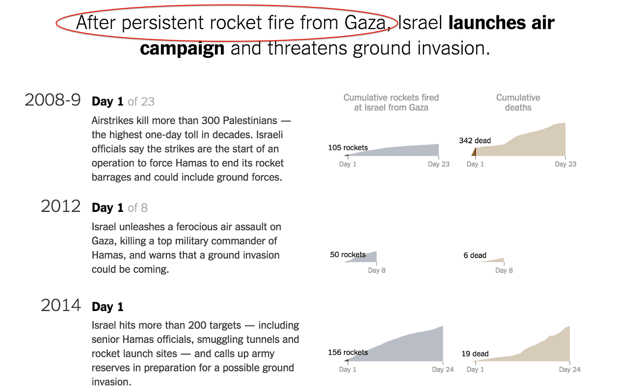
On July 31, 2014, the New York Times published an interactive article about the Israeli assault that was underway in Gaza. In an expertly designed data visualization, the Times guided us through its own version of events, which boils down to: Hamas started it, and Israel responded in self-defense. A common misconception about data journalism is that it’s somehow less biased than traditional print journalism, but Anna Flagg and Moiz Syed breakdown some ways that design can be misused to tell a slanted story. This New York Times article reminds us that design is just as much an editorial tool as it is a tool of aesthetics.
Author
